Stop the Clutter: 5 Dashboard Design Best Practices for Clearer Insights
Learn 5 dashboard design best practices to turn messy data into clear actionable insights. Improve productivity and decision-making with expert tips from Exology.
BUSINESS INTELLIGENCE
Key Points
Data clutter leads to information overload and costs companies millions in lost productivity and poor decision-making.
Effective dashboards focus on 5 to 7 high-level metrics to stay within the limits of human memory and avoid data noise.
Visual hierarchy places the most critical information in the top-left corner to follow natural reading patterns.
Using color as a communication tool and adding white space helps users focus on outliers and reduces mental stress.
Choosing simple charts like bar and line graphs prevents data distortion and makes business trends easier to identify.
Mobile-first design ensures that busy leaders can access clear insights through responsive and thumb-friendly layouts.
Actionable takeaway: Perform a data audit to identify which metrics lead to direct actions and remove any chart that does not drive a specific business decision.
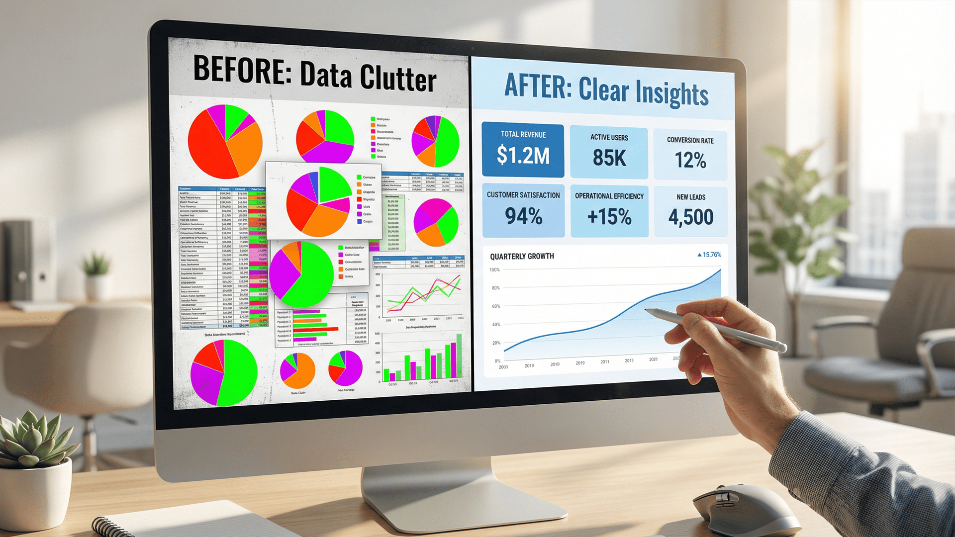
Every modern business is drowning in data. You have sales figures, marketing metrics, and operational costs arriving every second. However, having data is not the same as having answers. Many leaders log into their dashboards only to be met with a wall of confusing charts and bright colors. Instead of feeling informed, they feel overwhelmed. This is called information overload. It slows down your team and hides the very insights you need to grow.
A well-designed dashboard acts like a GPS for your company. It should show you exactly where you are and how to get where you want to go. When a dashboard is cluttered, it is like a GPS that shows every single street name in the country at once. You cannot see your route. By following a few simple design rules, you can turn that clutter into a powerful tool for growth.
Why is dashboard clutter a major problem for businesses today?
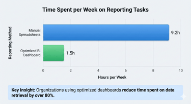
Clutter is more than just an eyesore. It is a drain on your company’s resources. When data is messy, employees have to work harder to find what they need. According to research from Slite, the average worker spends 3.2 hours each week searching for information. When your reports are confusing, that time increases. Your team stops analyzing the business and starts fighting the software.
There is also a significant financial cost to poor data presentation. Gartner reports that poor data quality and management cost organizations an average of $12.9 million per year. A big part of this loss comes from "flawed business reports." If your dashboard is too cluttered to read correctly, you might make a choice based on a misunderstanding. This can lead to missed sales opportunities or wasted inventory.
Finally, clutter leads to a lack of trust. If a manager cannot understand a chart in five seconds, they will often go back to using their "gut feeling." This defeats the entire purpose of investing in Business Intelligence. In fact, industry analysis shows that 85% of big data projects fail because of technical complexity and unclear objectives. A clean design is the best way to ensure your data actually gets used.
What are the top 5 dashboard design best practices for clarity?
How do you choose the right KPIs to avoid data noise?
The first step to a clean dashboard happens before you draw a single line. You must choose the right Key Performance Indicators (KPIs). A common mistake is trying to track everything at once. This creates "data noise." To keep your dashboard focused, follow the "rule of seven." Most people can only keep five to nine items in their short term memory.
Aim to display only 5 to 7 high-level metrics on your main screen. If a metric does not directly lead to a decision, it probably does not belong on the primary dashboard. Ask yourself: "If this number drops by 20%, what action will I take?" If you do not have an answer, that metric is just noise. You can always place detailed data on a secondary tab for deep dives.
Why is visual hierarchy the secret to a great dashboard?
Visual hierarchy is the way you arrange elements to show their importance. Your eyes naturally follow certain patterns when looking at a screen. In most cultures, people read in a "Z-pattern" or an "F-pattern." This means they start at the top left, move to the top right, and then scan down.
You should place your most critical KPIs in the top-left corner. This is the most valuable real estate on your screen. Use larger fonts or bolder colors for these numbers. As the user moves their eyes down and to the right, the data should become more detailed. This structure helps the brain process the most important "big picture" facts first before looking at the supporting details.
How can the right use of color and white space improve focus?
Color should be used as a communication tool, not as decoration. Too many colors create a "rainbow effect" that distracts the viewer. Use high-contrast colors to highlight outliers or problems. For example, use red only when a metric requires immediate attention. If everything is bright and colorful, nothing stands out.
White space is equally important. White space is the empty area between your charts and numbers. It gives the user's eyes a place to rest. Without white space, the dashboard feels cramped and stressful. Think of white space like the pauses in a conversation. It helps the listener, or in this case the viewer, understand when one idea ends and another begins.
Which chart types should you use for different data stories?
Choosing the wrong chart is a fast way to confuse your audience. Every chart should tell a specific story. Bar charts are best for comparing different categories, like sales by region. Line graphs are perfect for showing trends over time, such as monthly revenue growth.
Avoid using pie charts for complex data. Pie charts are difficult for the human brain to compare accurately, especially when there are more than three slices. Instead, use a sorted bar chart. This makes it much easier to see which category is the largest. Always label your axes clearly and avoid 3D effects. 3D charts might look modern, but they often distort the data and make it harder to read values accurately.
How do you design dashboards that work perfectly on mobile devices?
Modern executives are rarely at their desks all day. They check their numbers during meetings, at the airport, or between site visits. This means your dashboard must be responsive. A design that looks great on a 27-inch monitor might be unreadable on a smartphone.
When designing for mobile, prioritize "thumb-friendly" navigation. Use large buttons and ensure charts can be viewed in a vertical scroll. Avoid hover-over effects, as these do not work on touchscreens. A mobile-first approach forces you to be even more disciplined with your design. If a metric is not important enough to fit on a small screen, you might realize it is not important enough for the desktop version either.
How do these design principles improve your bottom line?
When you invest in better design, you see a real return on investment. Clear visuals lead to faster decision-making. According to PwC research, highly data-driven organizations are three times more likely to report significant improvements in decision-making. When your team can see a problem instantly, they can fix it before it costs the company more money.
Better design also reduces operational costs. Experts suggest that improving data quality and visualization can lead to a 20% to 30% reduction in operational costs. You save money by eliminating the hours your staff spends manually fixing errors or re-explaining reports. A clear dashboard creates a "single source of truth" that keeps everyone aligned.

How can companies start their data journey?
Starting a digital transformation can feel like a huge task. The best way to begin is with a data audit. Look at the reports your team uses every week. Identify which ones are ignored and which ones lead to action. This helps you find your "data gaps."
Next, focus on upskilling your team. Gartner predicts that data talent shortages will continue through 2026. You do not necessarily need to hire a fleet of data scientists. Often, you can train your current managers to use modern Business Intelligence tools more effectively. By building a culture that values clear data, you set your business up for long-term success.
How Exology Helps
Exology is an expert in Business Intelligence and building high-impact dashboards. We help companies turn their hidden data into clear, actionable insights through customized solutions. Whether you are in Egypt, the MENA region, or operating internationally, we provide the tools you need to lead with confidence.
Global Authority: Exology has delivered over 150 projects worldwide, helping diverse organizations modernize their operations.
Operational Excellence: Our solutions are designed for maximum impact. In 2025 alone, we saved our clients over 5,000 hours of manual work.
Proven Financial Results: We focus on the bottom line. Exology has been able to save a single client $130,000 in just one day by identifying critical data insights.
Customized BI Solutions: We do not believe in one-size-fits-all. We build bespoke dashboards that follow the highest design standards for clarity and speed.
Read More
Contact us
Whether you have a request, a query, or want to work with us, use the form below to get in touch with our team.