Make Your Data
Easy to Understand

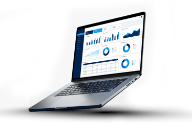
Data Vizualization
We turn complex data into clear visuals so your team can see what matters and act faster.
Built Over 1400+ Vizualizations
Trusted by 150+ Businesses

What We Offer
Dashboard Design
We design dashboards that are clear, structured, and easy to use.
We turn your data into visuals that make insights clear and easy to act on.
Chart & Graph Design
We choose the right visuals for your data so insights are easy to see.
Report Design
We create reports that communicate insights clearly, not just display data.
Data Storytelling
We structure data to tell a clear story so your team understands what is happening and why.
Visualization Optimization
We improve your existing dashboards and reports to make them clearer and more effective.
Understand data instantly
Stop hunting through confusing reports. Visuals show trends and outliers at a glance.
Make Faster Decisions
When the data is clear, your team acts immediately instead of waiting for explanations.
See what matters
We highlight KPIs and critical metrics so attention goes to the right place.
Reduce reporting mistakes
Clear visuals reduce misinterpretation and ensure everyone sees the same story.
Improve team adoption
When dashboards are easy to read, more people actually use them.
Communicate confidently
Share charts and reports that anyone can understand, from your team to leadership.
The Benefits
Technologies We Use
We use the tools that fit your business, your data, and your systems.
We are not tied to one platform. Our Approach ensures that we select and implement the best tools for each unique project, tailoring solutions to your specific needs.
Why Exology is Different
Many dashboards look good but are hard to read.
We design visuals that make your data clear in seconds.
We design for understanding, not appearance
We choose visuals based on the question
We don’t use charts randomly.
Each visual is selected to answer a specific business question.
We remove what does not matter
Clutter hides insights.
We simplify your dashboards so your team focuses on what matters.
We design for how your team actually works
We don’t design in isolation.
We build visuals around how your team reads, uses, and acts on data.
We connect visuals to Decisions
Every chart has a purpose.
Your dashboards help your team decide what to do next.
We improve what you already have
You don’t always need to start from scratch.
We can redesign your existing dashboards to make them clearer and more effective.
02
03
05
06
01
04
How To Get Started
01
Book a Discovery Call
Tell us about your business, your data, and your challenges.
02
Define What You Need to See
We identify the metrics, visuals, and structure that make your data clear.
03
Design the Visuals
We design dashboards, charts, and reports that are simple and easy to use.
04
Deliver and Refine
We deliver the visuals, gather feedback, and improve them over time.


Ready to Get Started?
Book a free call and we’ll show you how to turn your data into clear decisions.
No commitment. 30-minute call. Clear next steps
Frequently Asked Questions
Why are our current dashboards hard to use?
Most dashboards are built to show data, not to explain it.
We redesign them so your team can understand what matters at a glance.
How do you decide which visuals to use?
We choose visuals based on the data and the question you need to answer.
Each chart is selected to make the insight clear, not just to look good.
Can you improve our existing dashboards instead of rebuilding them?
Yes.
We review your current dashboards, remove clutter, and redesign them to be clearer and easier to use.
How do you make sure people actually use the dashboards?
We design for real usage.
We keep visuals simple, highlight key metrics, and align everything with how your team works.
Do you only work with Power BI or specific tools?
No.
We work with tools like Power BI and Tableau, and we use what fits your systems and your team.
Will this work with our current data setup?
Yes.
We connect your visualizations to your existing data sources and systems.
Do you help design reports for presentations or management?
Yes.
We design reports that clearly communicate insights to leadership and stakeholders.
How long does it take to design dashboards or reports?
It depends on the complexity.
Some improvements take days. Larger designs can take a few weeks.
What is the difference between data visualization and business intelligence?
Business intelligence tracks performance through dashboards.
Data visualization focuses on making that data clear and easy to understand.
What happens after the dashboards are delivered?
We gather feedback, refine the visuals, and support your team to keep everything clear and useful.
Contact us
Whether you have a request, a query, or want to work with us, use the form below to get in touch with our team.